A Guide To Pigments

Learn Useful Things About Your Paints
It’s easy to get used to going to the art shop and just selecting the most suitable tubes of paints. Even if contemporary painters don’t necessarily have to make their own paint, it’s very useful to know the components of your primary medium, This guide is for everyone who’s interested in broadening their knowledge about paints and their colours.
What Are Pigments?
Pigments are fine powders, used for the colouration of paints, inks, ceramics, plastics and wax.
In order to be able to use them, pigments have to be added to liquids. When the solvent evaporates or cools down, the pigment molecules solidify.
A Little Pigment History
- Until around the 19th and 20th centuries painters mostly used paint made from natural minerals
- Before paints began to be manufactured in factories, painters (or their apprentices) were in charge of making their own pigments and paints.
- Pigments play a very big role in identifying the age of a painting, for example Prussian blue was first available in 1706, and lead-tin yellow was only used until the 18th century.
Different Pigment Types
- Earth colors – ochres, umbers, siennas, terre verte
- Mineral colours – azurite, malachite, lapis lazuli (ultramarine), cinnabar
- Organic colours – cochineal (derived from insects), Indian yellow, indigo
- Manufactured colours – lead-tin yellow, white lead, verdigris, Prussian blue, vermilion
Lemon Yellow
(Steinbühl yellow, barium yellow, yellow ultramarine)
Lemon yellow pigment has been used since the early 1800s. It has an opaque quality, and excellent light-fastness.
It has a tendency to turn slightly greenish when mixed with oil binders.
Green Earth
(terre verte, Verona green)
Green earth pigment is a mixture of different minerals (glauconite, celadonite), and has been used since antiquity. In medieval Italian paintings, it was common to use it for under-painting for flesh tones.
Ultramarine Blue
(lazurite, french ultramarine)
Organic Ultramarine has been used for the last 6,000 years from when they first began mining its base mineral, lapis lazuli. It was used in Egyptian tomb painting then later in Europe by artists such as Leonardo da Vinci, Raphael, and Michelangelo Buonarotti. Synthetic ultramarine has been produced since the 19th century.
Zinc White
(chinese white)
Up until the end of the 18th century, the main pigment for white paint was lead white, however, due to its toxicity, it was ideal to replace it with zinc white. And not only that, zinc white proved to be less opaque, which was favourable for 19th century’s changing colour preferences, as it was easier to create more vibrant colours.
Cadmium Red
(selenium red, cadmium scarlet)
Cadmium red pigment has always been a popular colour choice from Edvard Munch to Salvador Dali and Francis Bacon. However, the pigment is quite expensive due to the scarcity of cadmium metal, not to mention its toxicity. In 2015 artists faced a possible Europe-wide ban, but luckily it hasn’t been issued and artists no longer have to fear the disappearance of their vibrant reds and oranges.
Vandyke Brown
(Cassel earth, Cologne earth)
Vandyke brown pigment or “earth” as it is sometimes referred to as, is very telling: it contains almost entirely organic compounds like soil, and it has been a very prominent colour choice of old masters, since the 17th century.
Bone Black
(Ivory black, bone charcoal)
Bone black pigment also has a telling name: it’s partly made out of carbonised animal bones. It’s also sometimes called ivory black which is similar but more exclusive as it’s made out of carbonised ivory pieces.
Description of pigments:
http://www.visual-arts-cork.com/artist-paints/colour-pigments.htm
Get to Know the Universal Pigment Codes!
It’s very useful to choose your paint consciously – knowing what different signs and symbols indicate on the paint tube can save you from buying unwanted colours, as well as predicting the mixed colours interaction.
It’s good to learn what Colour Index names mean, as they tell which specific pigment(s) make up that particular colour.
The United States the Association of Textile Chemists and Colorists (AATCC) standardises these codes. They have two parts; ten pigment codes and different numbers after them.
Colour Index Names
PY = Pigment Yellow
PO = Pigment Orange
PR = Pigment Red
PV = Pigment Violet
PB = Pigment Blue
PG = Pigment Green
PBr = Pigment Brown
PBk = Pigment Black
PW = Pigment White
PM = Pigment Metal
Other things to note:
- Colours that have a “hue” in their name means that the paint was made with less expensive substitute pigments, but are a very similar colour.
- paying attention to Colour Index Names can help you with mixing colours as well. It’s particularly useful when you only need a small amount of a particular colour. For example, Payne’s Grey is made from Ultramarine Blue (PB29) and Carbon Black (PBk7)!
- The same codes might be on different but produce a similar colour. For instance, both Burnt Sienna and Raw Sienna have PBr7 pigment, the difference is how these pigments were prepared for the two colours.
- You might want to keep in mind that some paints that have more than one Colour index name, indicating that the colour is made up of more pigments, therefore you might not want to mix that colour more as the high consistency of different pigments could result in a dull colour.
What is Light-fastness?
Pigments’ light-fastness means how much they are resistant to change when exposed to light. This can depend on the pigment’s chemical composition and whether it is mixed into oil, acrylic or other type of paint. Generally, light-fastness determines the “life expectancy” of the artwork, as less light-fast paints are sure to eventually fade.
There are different systems to determine the light-fastness of paints and pigments.
- The American Society for Testing and Materials’ light-fastness rating:
ASTM I — Excellent Light-fastness
ASTM II — Very Good Light-fastness
ASTM III — Not Sufficiently Light-fast to be used in artists’ paints
- There are some colours without ASTM ratings, therefore Pigments usually have the B/S (British Standard) ratings, a scale that goes from 1 to 8. (8 being the most light-fast)
- The light-fastness of Royal Talens products is indicated on tubes, labels and colour charts by these symbols:
+++ = at least 100 years light-fast under museum conditions
++ = at least 25 – 100 years light-fast under museum conditions
+ = at least 10 – 25 years light-fast under museum conditions
º = at least 0 – 10 years light-fast under museum conditions
What’s the Difference between Pigments and Dyes?
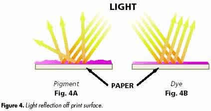
- colour-giving substances are separated into two types: dyes and pigments. The main difference between them is their light-fastness. Dyes blended with paint or ink have a maximum of moderate light-fastness.
- Dyes dissolve in water, pigments are insoluble.
- Dyes are used for illustrative purposes, when preserving the original work is not essential, as it will be published.
Things to Know About Opacity and Transparency
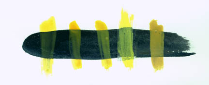
- Pigments can be arranged on a scale between Opaque and Transparent qualities.
- The main difference comes at the stages of painting: for instance, painting with a light but opaque colour will be visible on a dark surface, but not the other way round.
- The paint’s opacity and transparency does not relate to pigment density!
Opaque Pigments:
Cadmium yellows, Cadmium reds, Cerulean blue, Yellow ochre, raw sienna, raw umber
Transparent Pigments:
Hansa yellow, Azo yellow, Quinacridone reds, Pthalo blue, Ultramarine, Burnt sienna.
In-between:
Cobalt blue, Burnt Umber

From left to right, the yellows shown are PY110 , PY 153, PY108, hansa yellow (PY3), and yellow ochre.
What are the signs on paint tubes
Useful :
The Colour of Art Pigment Database
http://www.artiscreation.com/Color_index_names.html#.WK1q22_yhQJ
A Vault of Colour: Protecting the World’s Rarest Pigments
References
- http://katharinethayer.com/html/optrans.html
- http://www.chromaonline.com/products/au/archival_oils/colour_range/lightfastness_rating_what_it_means
- https://www.royaltalens.com/information/frequently-asked-questions/lightfastness/
- https://www.handprint.com/HP/WCL/pigmt6.html
- http://www.artiscreation.com/Color_index_names.html#.WK1r02-LRQI
- https://www.youtube.com/watch?v=SJz6i_YeTEA
- http://www.museartanddesign.com/paints-pigment-codes/
- http://www.artiscreation.com/ColorCharts.html
- http://makingamark.blogspot.co.uk/2008/06/colour-naming-dyes-pigments-and-paints.html
- http://stapletonkearns.blogspot.co.uk/2010/09/color-index-names-what-in-this-paint.html
- http://www.lilinks.com/mara/pigments.html
- http://www.essentialchemicalindustry.org/materials-and-applications/colorants.html
- http://learn.leighcotnoir.com/artspeak/elements-color/hue-value-saturation/


